Measuring changes
How are changes measured?
If an index of stockmarket prices rose from 1,200 to 1,260, you could say either that it rose by 60 points or, alternatively, that it increased by 5%.
Stating the increase as 60 points (an absolute measure) is simple and straightforward. Yet to interpret the figure it must be judged against another figure, such as the starting level. A rise of 60 points in an index standing at 120 is much more dramatic than an increase of 60 points in an index which started at 12,000.
The percentage change (a relative measure) is easy to interpret. It indicates the size of a change when the starting level is 100. Percentages therefore provide a consistent yardstick for interpreting changes.
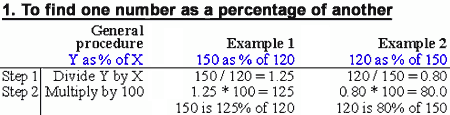
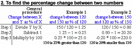
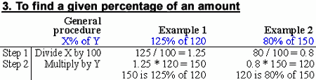
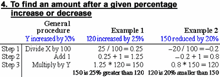
Calculating percentages
This is a matter of simple arithmetic. Basic rules for calculating percentage changes are given below. The various operations in the examples are similar. They are designed to minimise the number of key strokes required when using a calculator. Multiplying or dividing by 100 and adding or subtracting 1 can be done by eye.
 |
 |
 |
 |
1 basis points = 0.01 percentage point
10 basis points = 0.10 percentage point
25 basis points = 0.25 percentage point
100 basis points = 1.00 percentage point
Common traps when measuring changes
Units and changes
Do not confuse percentage points with percentage
changes. If an interest rate or inflation rate increases from 10% to 13%, it
has risen by three units, or 3 percentage points, but the percentage increase
is 30% (3 / 10 * 100).
Up and back
A percentage increase followed by the same percentage decrease results in a figure below the starting level. For example, a 50% rise followed by a 50% cut leaves you 25% worse off.
| $1,000 increased by 50% is $1,500. | |
| 50% of $1,500 is $750. |
Starting levels
A 10% pay rise for chief executives earning $500,000 a year puts an extra $50,000 in their annual pay packets. The same percentage increase for cleaners on $10,000 a year gives them a mere $1,000 extra.
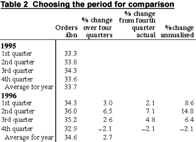
The importance of the base from which changes are calculated is also illustrated in Tables 1 and 2.
Using Table 1, it could be claimed that in February 1997 the 12-month rate of inflation fell from 10% to 0%. In fact all that happened is that the increase a year earlier fell out of the 12-month comparison. In this example, shop prices changed just once during the period January 1995 - February 1997, perhaps owing to an increase in the rate of sales tax or VAT.
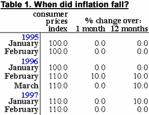
Table 2 shows that orders in the third quarter of 1996 were down from the previous quarter. However, the figure for the previous quarter was unusually high, and the third quarter figures were better than the first quarter's and any quarter of 1995. When comparing data over several years it is easy to overlook the distortion that can arise from using an unusually high or low starting or ending value.
Growth rates
If consumer spending rises by 1% a month, by how much will it increase over a full year? Not 12%, but 12.7%. Each month expenditure is 1% greater than the month before and each percentage increase is calculated (compounded) from a higher base. Thus 12.7% a year is the same as 1% a month annualised. It is important to distinguish between the following terminology.
| 12-month or 4-quarter change. This compares one month or quarter with the same one in the previous year. For example, orders rose 2.6% between the third quarters of 1995 and 1996. | |
| Change this year. This compares the latest figure with the very end of the previous year. For example, when third quarter figures for 1996 were published, commentators might have said that orders had risen by 4.8% over the three quarters to the third quarter of 1996. | |
| Annualised change. This is the change which would occur if the movement observed in any period were to continue for exactly 12 months. For example, orders rose 6.4% annualised during the first three quarters of 1996. | |
| Annual change. This compares the total or average for one calendar or fiscal year with the previous one. For example, orders in 1996 were 2.7% higher than in 1995. | |
| Change to end-year. This compares end-year with end-year: eg orders fell by 2.1% over the four quarters to end-1996. | |
Moving averages
One way to smooth out erratic fluctuations in a series is to look at a moving average. When reviewing, say, typical retail sales in July, you might take an average of figures for May, June and July by adding the values for these three months and dividing by the number of months. A sequence of such averages is called a moving average.
The order of a moving average refers to the numbers of periods over which the average is calculated. Choosing the correct order for your analysis is a trade-off. The higher the order the more likely you are to iron out erratic influences, but the slower it will be to show changes in trend.
Moving averages should be centred -- in other words, the average for a three-month period relates to the middle month. Interpretation is therefore easier if the order of the moving average is odd.
Mean
The mean is the most commonly used average. It is derived by adding up the numbers in a series and dividing the result by the number of observations. The problem with using the mean is that extreme outliers in a series can distort the result. In a series reading 1,2,3,4,5,6,7,100, the mean will be 16, which hardly reflects the distribution of the numbers.
Median
The median value addresses the problem of extreme outliers by identifying the mid-point in a series, the number at and below which 50% of the observations are grouped and at and above which the other 50% of the observations are grouped. In our series 1,2,3,4,5,6,7,100, the median value is identified by adding the two central values (4 & 5) together and dividing by 2, resulting in a median of 4.5. If the series contains an odd number of observations, things are even simpler -- the central number is the median.
Mode
The mode is the most common number in a series. If one number is repeated in a series and all of the others only appear once, that number is the mode. It represents the most popular value in a series.
Weighted averages
Weighted averages use the same principles described in our section on indices - the components in a series are each weighted to reflect their relative importance. In WorldData, weighted averages are used to calculate regional aggregates: to take one example, the aggregate growth rate of a region such as Eastern Europe is weighted to reflect that economies such as Russia and Poland, say, are far more important than smaller ones such as Estonia and Latvia.
Standard deviation
Standard deviation is essentially the average of the deviations from the mean. Calculating the standard deviation is tricky but it's a handy interpretative tool. As a very rough rule of thumb, two-thirds of a distribution is enclosed within one standard deviation of either side of the mean, and 95% within two standard deviations of either side of the mean. Three standard deviations should encompass all the observations within the series.
So if the mean were 50 and the standard deviations were 2, then roughly two-thirds of the observations would sit within the 48-52 band, roughly 95% would sit within the 46-54 band, and almost all observations would lie within the 44-56 band.
Trends
A trend attempts to capture the long-run path of the data over time. The trendline represents the line of best fit such that the difference between the line and the observed data is minimised.
A linear trend line shows absolute measures of economic performance, while an exponential trend line shows relative measures of economic performance, such as growth rates. Since we are often more interested in finding out the relative performance and not the absolute performance of economic measures, the exponential model tends to be more useful.
To take one example, fitting a linear trend line to real GDP in cash terms for the United States gives a value of about 230 for the absolute rate of increase, represented by the constant a. This would mean that real GDP was increasing at the absolute rate of $230bn a year. But if you fit an exponential trend line to the same series, then A represents the relative rate at which GDP is increasing per year. Just multiply the value of A by 100 to calculate the percentage figure - about 3.2% in this case. Note that if the value of a or A is negative, then there is a downward trend in the series you are analysing. Correspondingly, if the value of a or A is positive, then there is an upward trend in the series.
The other crucial thing to look at is the r value, or the coefficient of correlation, which represents the strength of the relationship between sets of data (see coefficient of correlation below).
In technical terms, choosing a linear trend fits the equation Y = b+at using the Ordinary Least Squares (OLS) algorithm. The constants, a and b, represent the slope and intercept of the trendline respectively and t represents chronological time periods. Choosing an exponential trend fits the log of Y = B(1+A)t using OLS, where B and A are constants.
Coefficient of correlation
Also known as r, this represents the strength of the relationship between sets of data and will always have a value between 1 and -1. If r = 0 , there is no linear correlation between the data sets. If r = 1 or -1, then there is a perfect linear correlation.
But be sure to interpret the data sensibly. If r = 0, that doesn't mean there is no correlation between the datasets, just that there isn't a linear relationship. Similarly, a high value for r may indicate that the two series in question is linked to a third unidentified series.
Logarithms
Logarithms are used to flatten out growth rates, enabling regression analysis of the relationship between sets of data. Logarithms are another name for the little number written in the air as powers: for instance in the figure 102 = 10 * 10 = 100, 2 is the logarithm of 100.
Related topics:
| Measuring economic activity |